PACKAGING REDESIGN
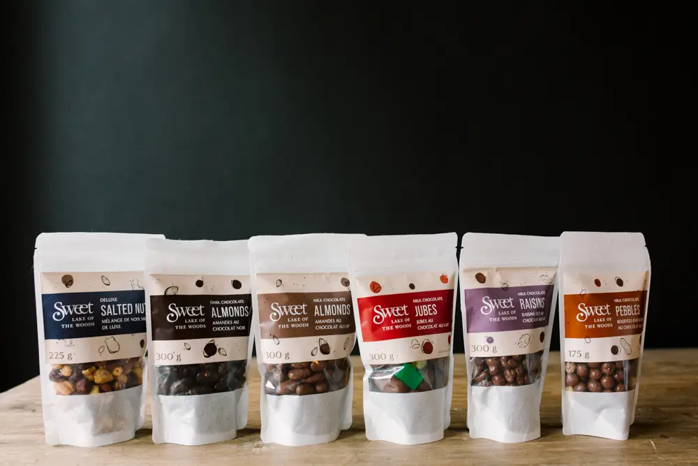
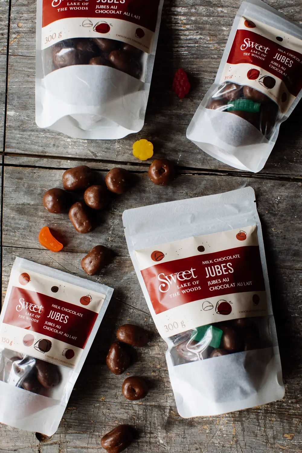
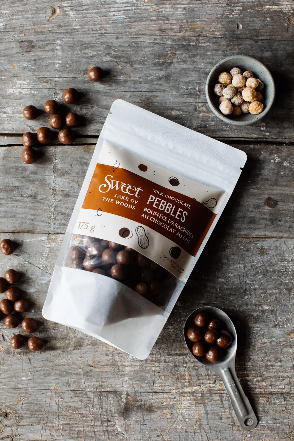
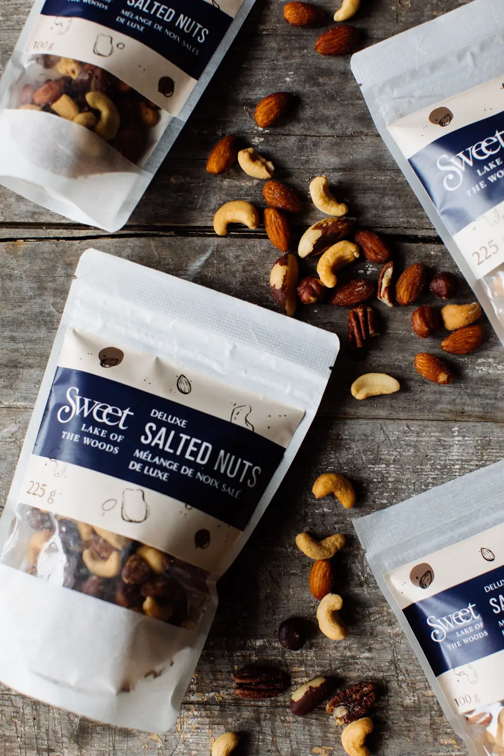
Sweet Lake of the Woods first approached us to redesign packaging for their six best-selling products, including the bag itself and the labels. Now, we have the pleasure of working with Alexis and her team on everything from their upcoming website (launching soon!), packaging for other products in the store, social media management, merchandise design, digital advertising, and more. You could say that it was love at first bite.
When we started working with Sweet Lake of the Woods, their branding was limited to just their logo, two brand colours, and a few graphics of the Lake of the Woods that were featured on some product labelling and merchandise.
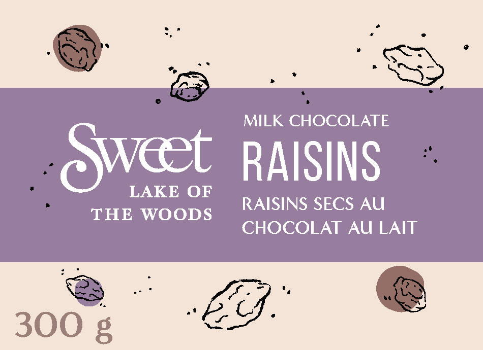
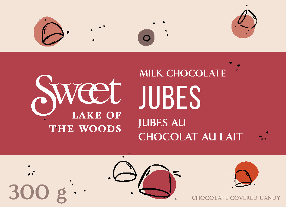
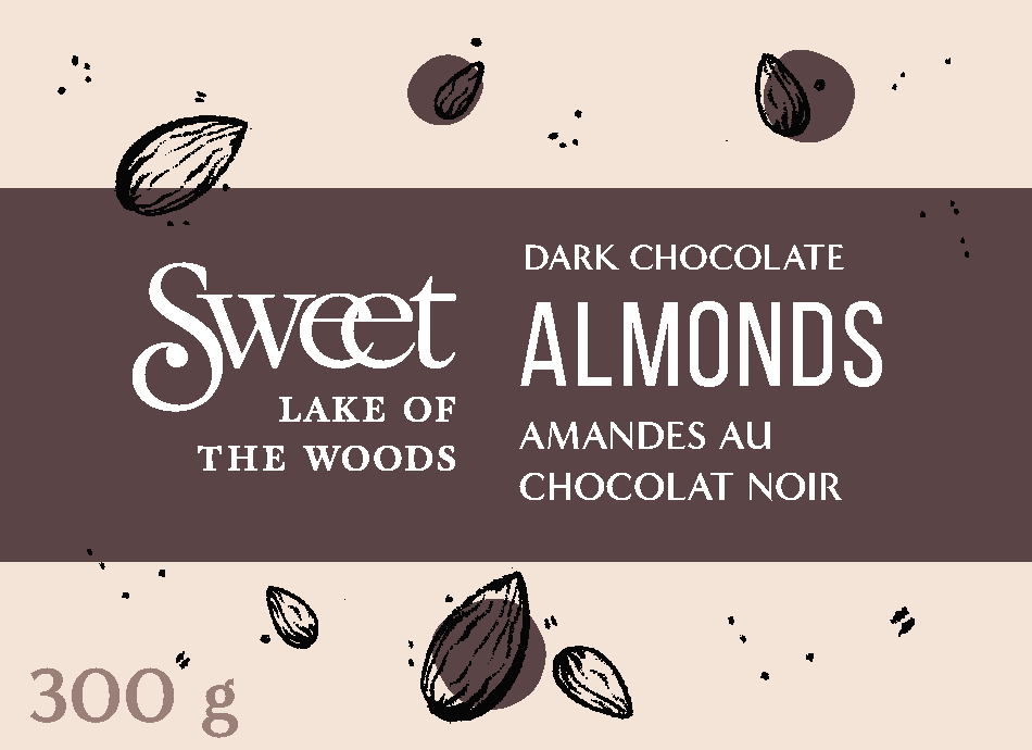
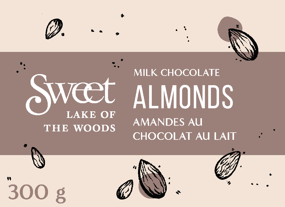
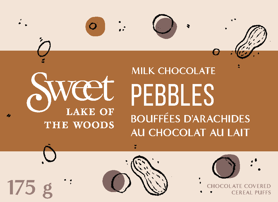
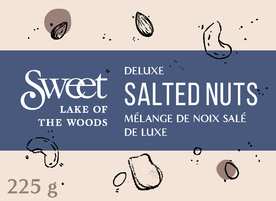
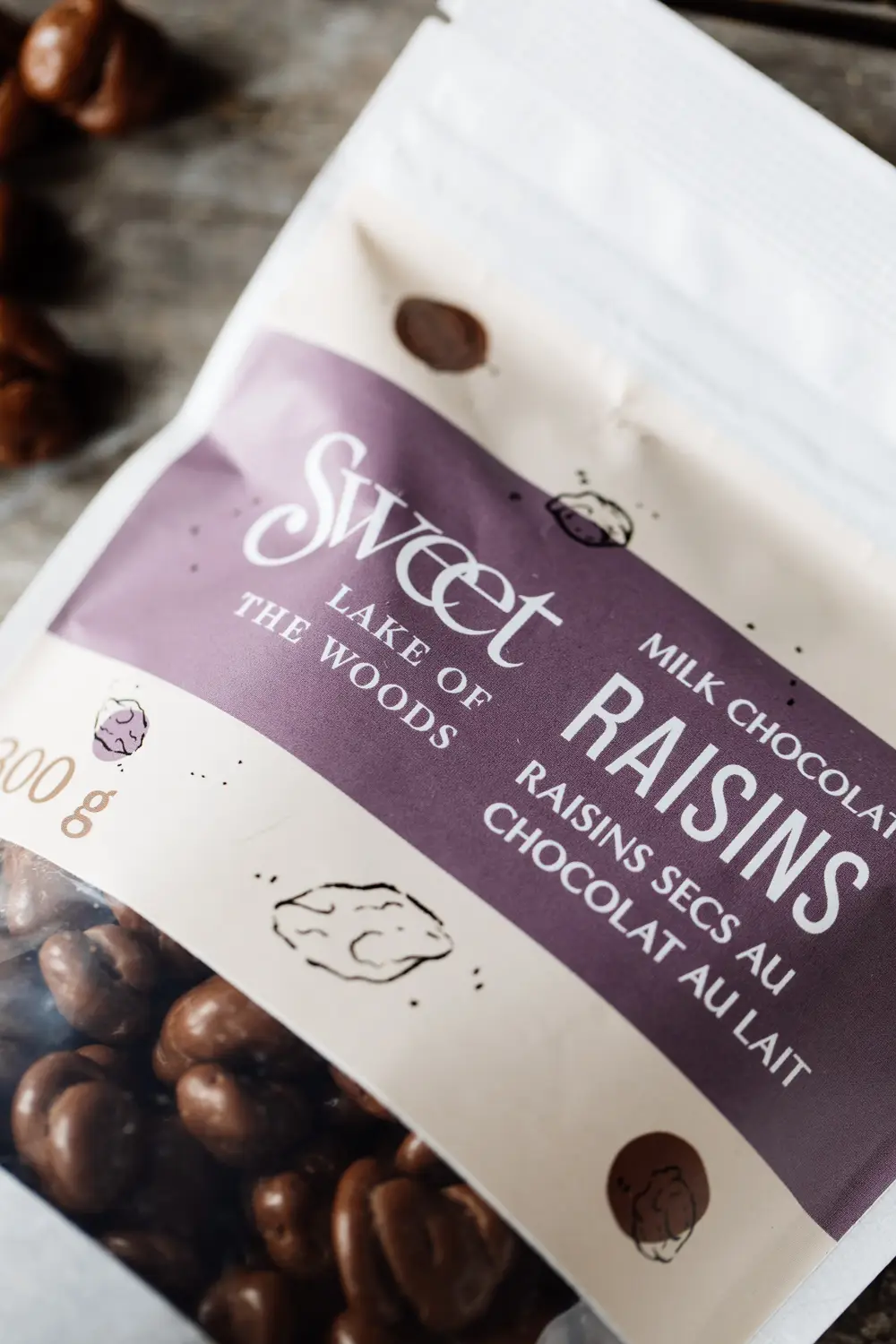
We began our process of designing new packaging by researching bag options, and by building an expanded colour palette so that each different product has its own accent colour associated with it. Then, we hand-illustrated components of each product, nodding to the handmade nature of the sweets. The final labels are playful, joyous, and most definitely sweet.
PACKAGING REDESIGN
While the labels were being printed and applied to the rice paper bags we selected, little teasers of the brand’s new look started to be released on social media and on the Sweet Lake of the Woods merchandise we designed. While we didn’t want to showcase any aspects of the new packaging directly, we let the hand-drawn feel inform all the designs we created – which has ultimately become a defining and recognizable feature of the Sweet Lake of the Woods brand.

