One Organic Farm is a family-run business located just outside Waldron, Saskatchewan—stretching 40,000 acres all the way to Whitewood. On their property, a collective of men and women from around the world farms their wholly organic products together.
The Story
One Organic Farm prides itself on being more than just a family farm, but also a farm for families. Their mission is to bring local, organic food to Canadians in order to reduce the need for Canada to import grains like wheat, which grow so readily across the prairies.
They are committed to changing the way the food industry views, perceives, and negotiates with farmers, and are also committed to making an impact beyond the country they call home. For each purchase of one of their products, they donate $1 to charity: water, a non-profit organization dedicated to delivering clean, safe drinking water to every individual across the world.
They are committed to changing the way the food industry views, perceives, and negotiates with farmers, and are also committed to making an impact beyond the country they call home. For each purchase of one of their products, they donate $1 to charity: water, a non-profit organization dedicated to delivering clean, safe drinking water to every individual across the world.
Refreshing the Brand
One Organic Farm approached us to refresh their logo and update their branding, packaging, photography, and website.
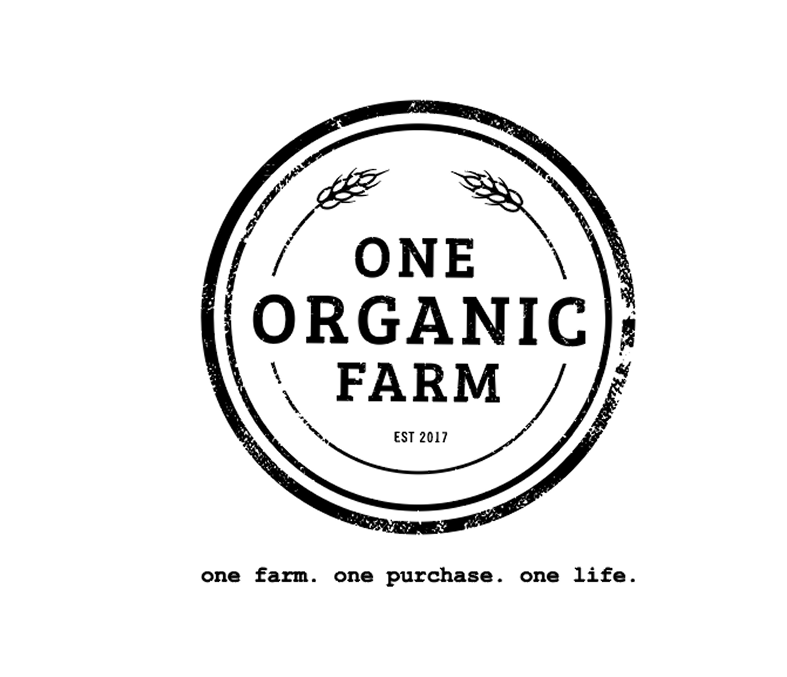
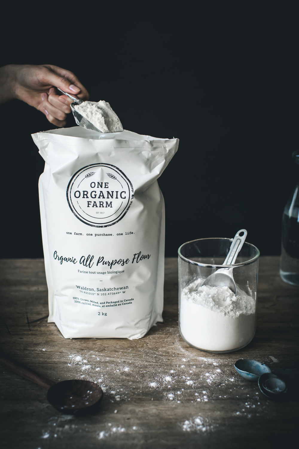
We started the process of creating their new logo by first building a strong wordmark. The three words, One Organic Farm, stacked on top of each other, feel balanced and form a structure that fits perfectly into a circle—an element we carried forward from the previous logo.
We built out their logo by adding a simple illustration of wheat, which communicates One Organic Farm’s attention to detail and the importance of each grain in the harvest. Lastly, we applied texture to add a rustic quality to the brand, which complements the modern and classic serif wordmark.
Creating the Collateral
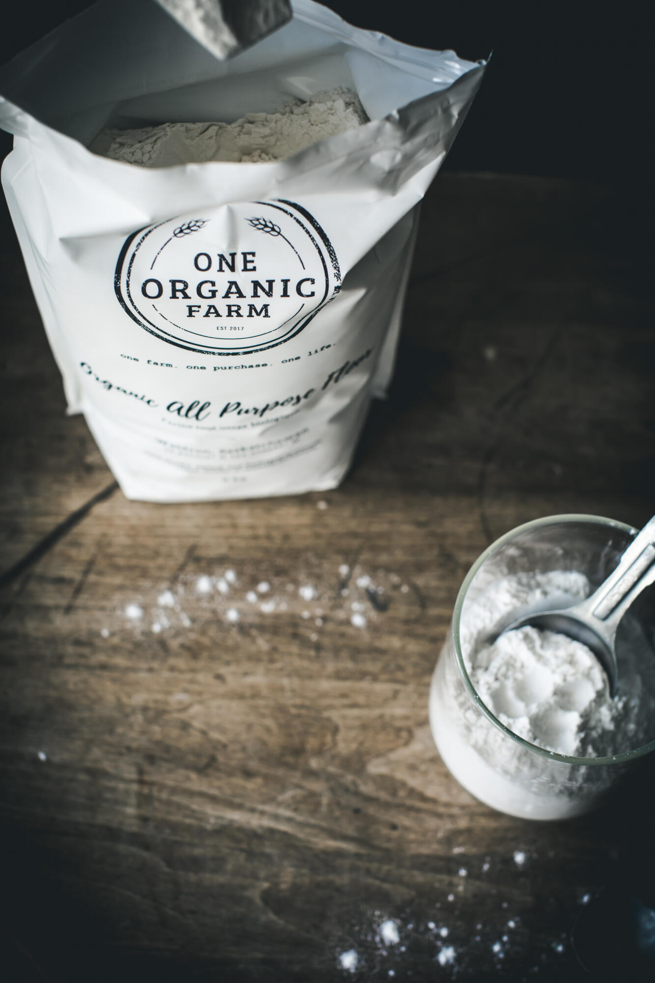
The packaging, website design, and photography quickly followed the rebrand. We designed packaging for One Organic Farm that was simple, streamlined, and would stand out among competitors’ products on the shelf. The client wanted to capture an authentic farm experience—referencing an old barn as an aesthetic they wanted to evoke—and also requested that the packaging be only black and white, apart from a few affiliate logos on the back.

The website was designed to mirror the packaging, creating a cohesive brand experience. Both are strong and minimal, allowing customers to quickly and efficiently find the information they need. Furthermore, the simple website design allows the photography to shine.
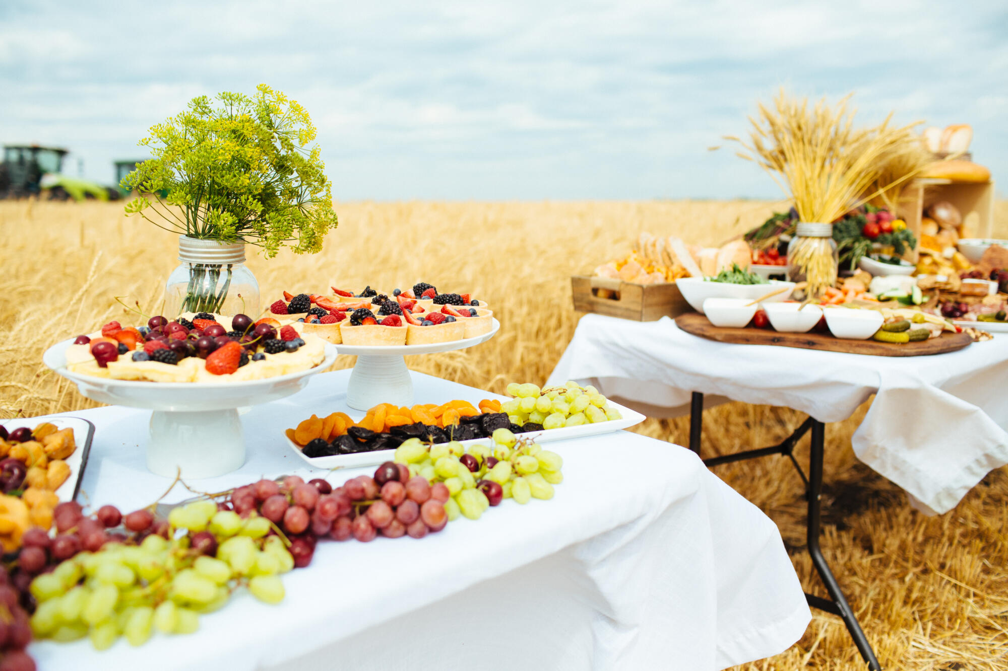
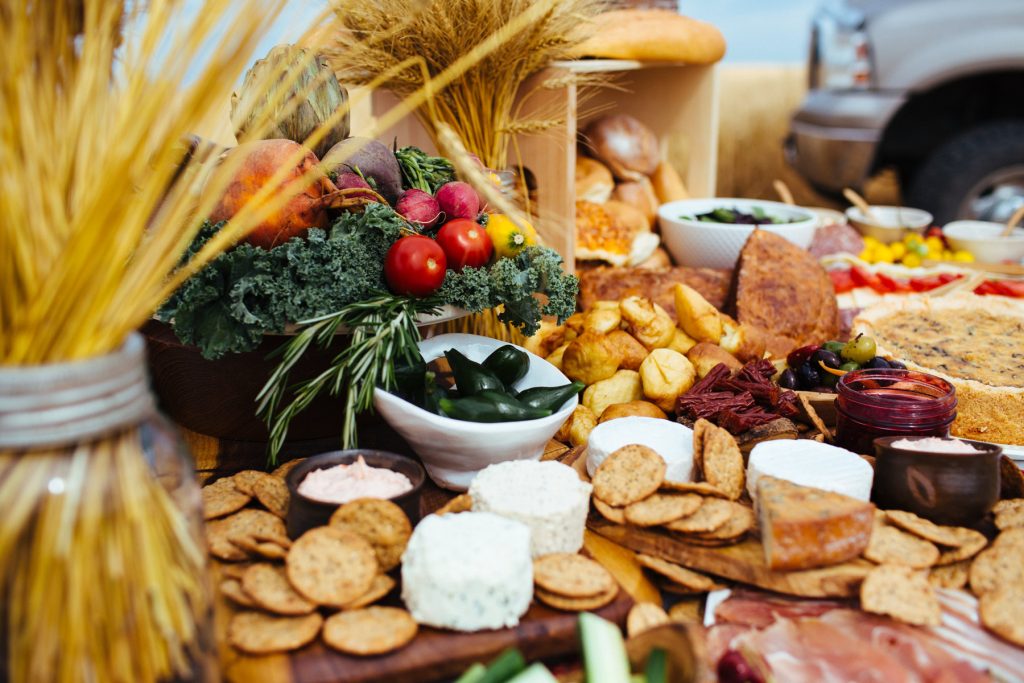
The art direction for the photos featured on their website was inspired by the wheat and other grains grown on the farm. We aimed to bring out the golden tones in the crops to evoke sunshine while ensuring that the colours of the other produce remained vibrant and mouthwatering.
The art direction for the photos featured on their website was inspired by the wheat and other grains grown on the farm. We aimed to bring out the golden tones in the crops to evoke sunshine while ensuring that the colours of the other produce remained vibrant and mouthwatering.