
Family Wealth Group is a privately owned, relationship-based, boutique wealth management firm located in Winnipeg, Manitoba, Canada. The aptly named Family Wealth Group first approached us to develop a new identity and digital presence that would reflect a recent shift in the company’s structure.
About the Family Wealth Group
The Family Wealth Group name, though direct, desired a supporting visual element with narrative quality that would communicate the company’s values. Inspired by the practice’s evolution and family history, we emphasized a sense of time through utilizing a strong serif typeface in a rich emerald green.

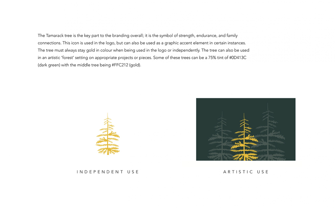
The icon that was subsequently developed derives from the beautiful seasonal cycle of the Tamarack Tree (native and its awe-inspiring golden fall colour, as a symbol of change for families moving through transition. Unlike most conifers native to Canada, the Tamarack tree has gentle needles that are almost feather-like. They are approachable and people are often drawn to them for their stature and beauty. The soft needles turn a beautiful golden colour, affording the stands of Tamarack a striking contrast to the fall foliage of other deciduous trees and evergreens. The brand highlights the dynamism of transition – similarly to how the company works directly with families to ensure that transition – however it is taking place – occurs with ease grace and purpose.
About Family Wealth Group
As the primary informational access point for their clients and potential clients, it was imperative that the new website’s written content exuded warmth. Significant energy was put towards developing a voice that was direct, interested and most importantly, supportive. The visuals throughout balance casual portraits and candid moments of the Family Wealth Group team in their offices, with atmospheric, calming visuals of trees and water along the expansive Manitoba horizon. The site’s navigation remains paired back, down to the essentials, with ease of engagement for their audience top of mind.
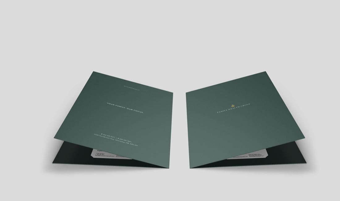
As the brand became solidified in digital space, it was time to direct attention internally. A feasible and approachable strategy for engaging LinkedIn and social platforms was presented. Print collateral directed at their strong base of clients included post cards with messages of appreciation and elegant yet substantial client folders, embossed with a gold leaf Tamarack tree upon a rich forest green cover.
As the brand became solidified in digital space, it was time to direct attention internally. A feasible and approachable strategy for engaging LinkedIn and social platforms was presented. Print collateral directed at their strong base of clients included post cards with messages of appreciation and elegant yet substantial client folders, embossed with a gold leaf Tamarack tree upon a rich forest green cover.
Play Video