The Challenge
The transformation from brick-and-mortar-centered to digital space demanded a complete orientation. A new sitemap awaited development, paving the way for an entirely different user journey. A new art direction was also needed to embrace the fresh brand identity.
* all photos provided by the client
The Solution
The strategy took center stage, orchestrating an e-commerce-centric website that merged the charm of the showroom with the ease of digital shopping.
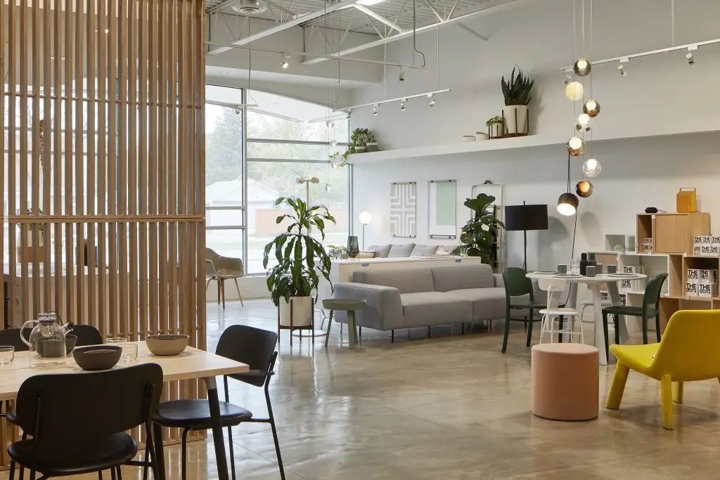
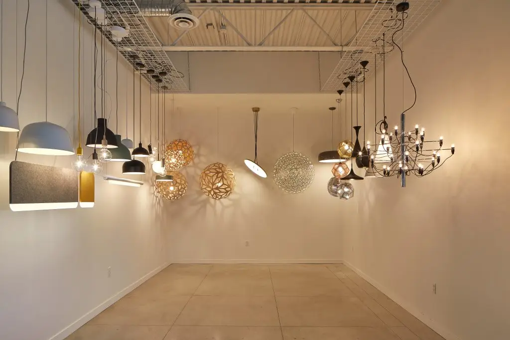
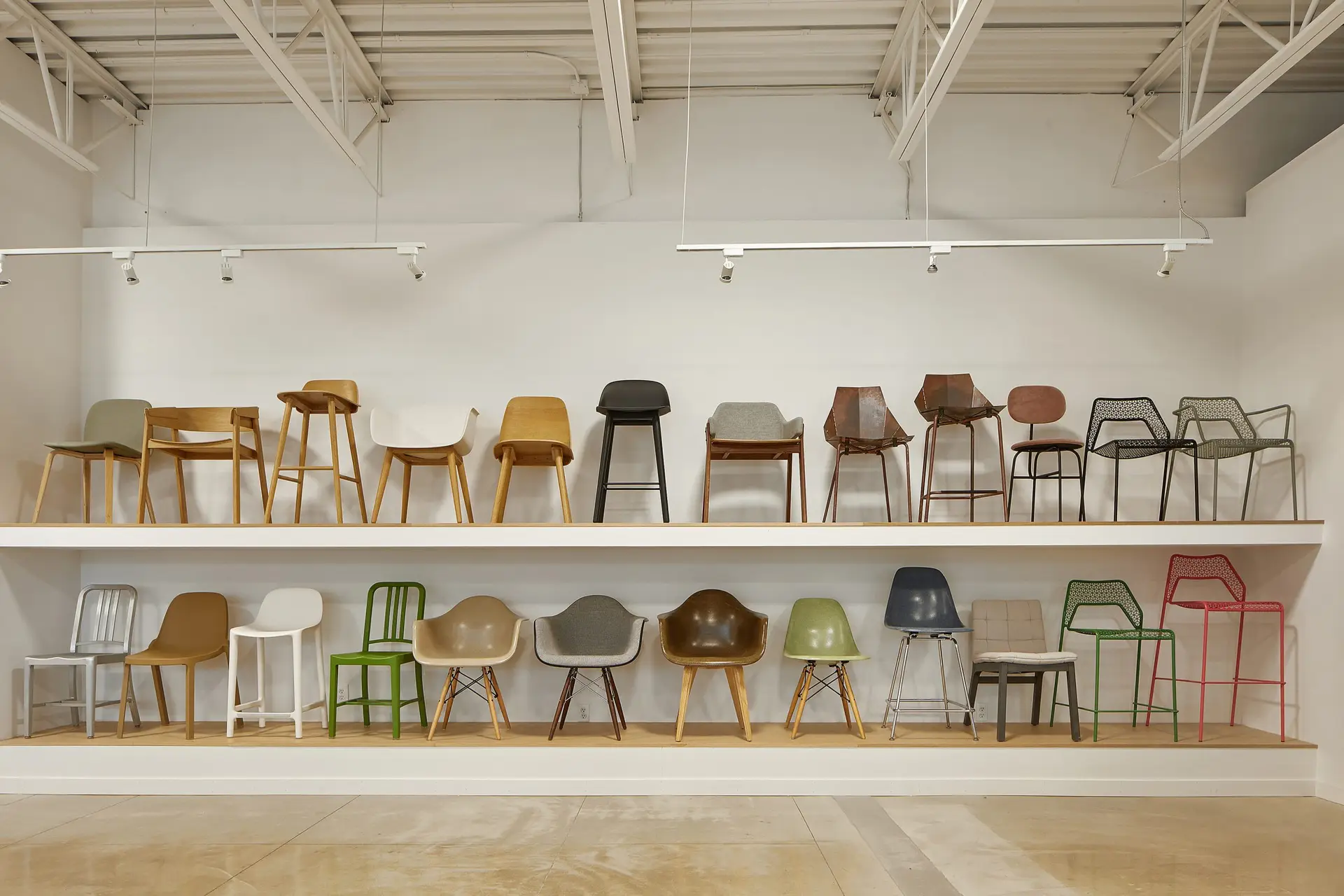
To reflect the distinctive product selection, the website adopted a minimalist style linearity design and tonality (a soft burnt rose) of the brand identity. Airy photography of the space enlivened the homepage, and interior pages were organized within a straightforward, easy-to-use drop-down format, ensuring simplicity and practicality.
A blog was added to the website to further improve customer experience with a deeper vision of HUT’K’s design inspirations. Combining brand identity with functionality, a dedicated brand narrative and content strategy was created for the blog. Keep a lookout for it on their website!


