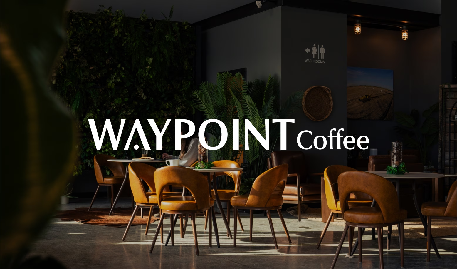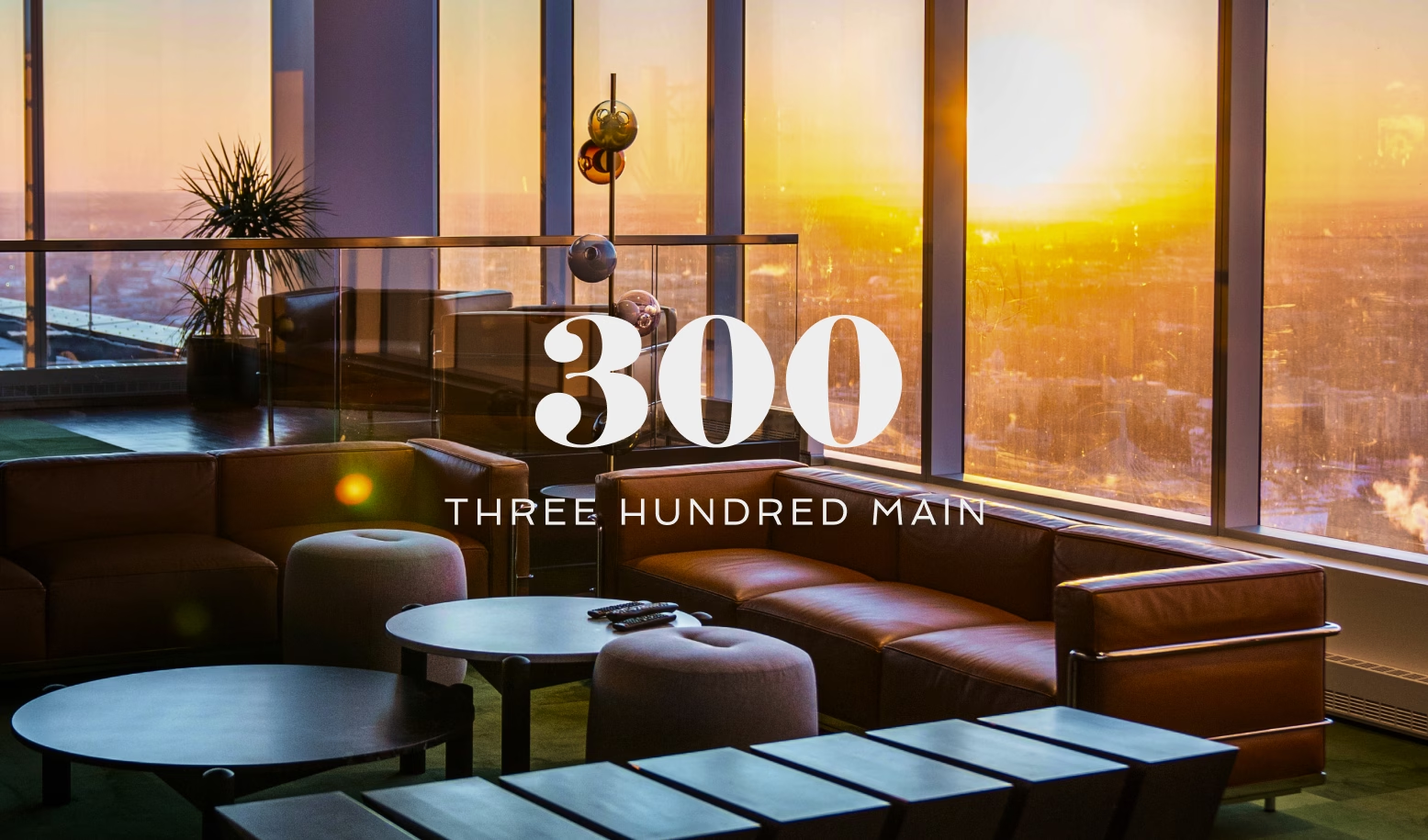
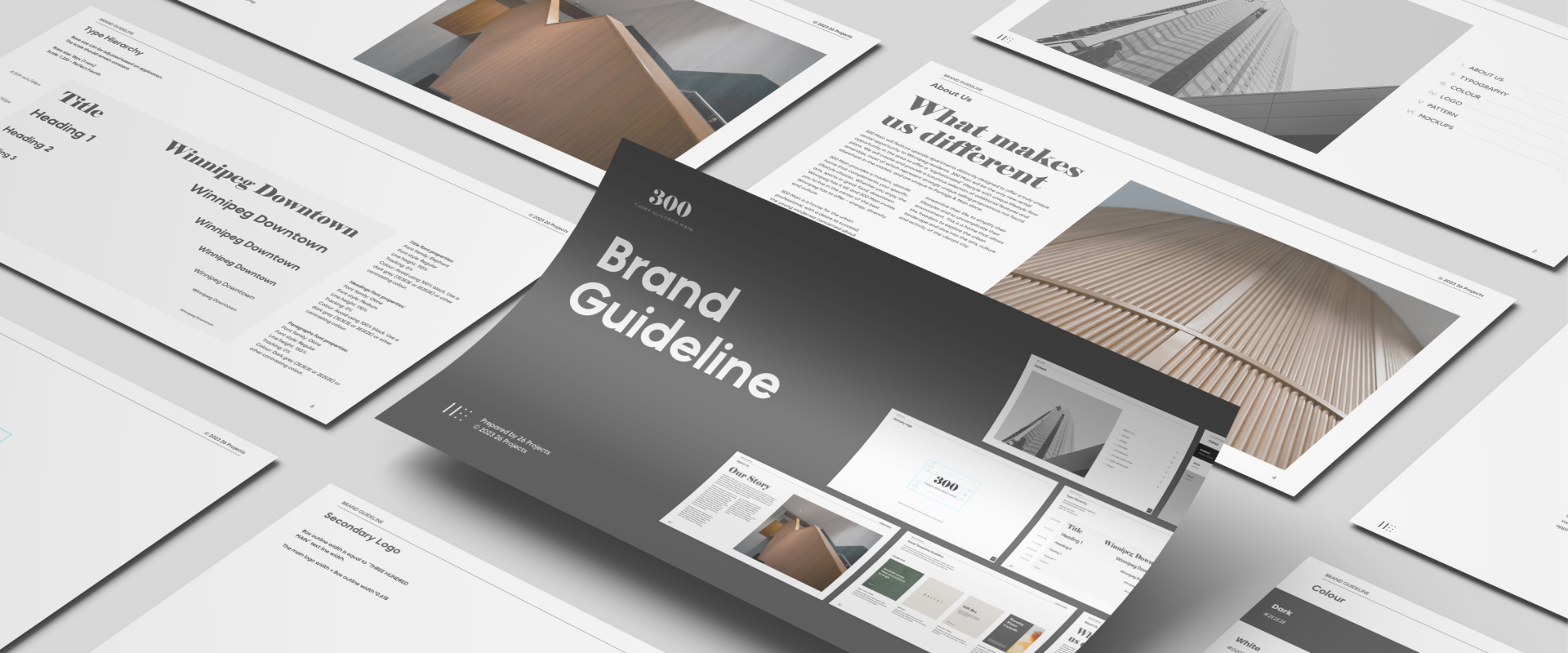
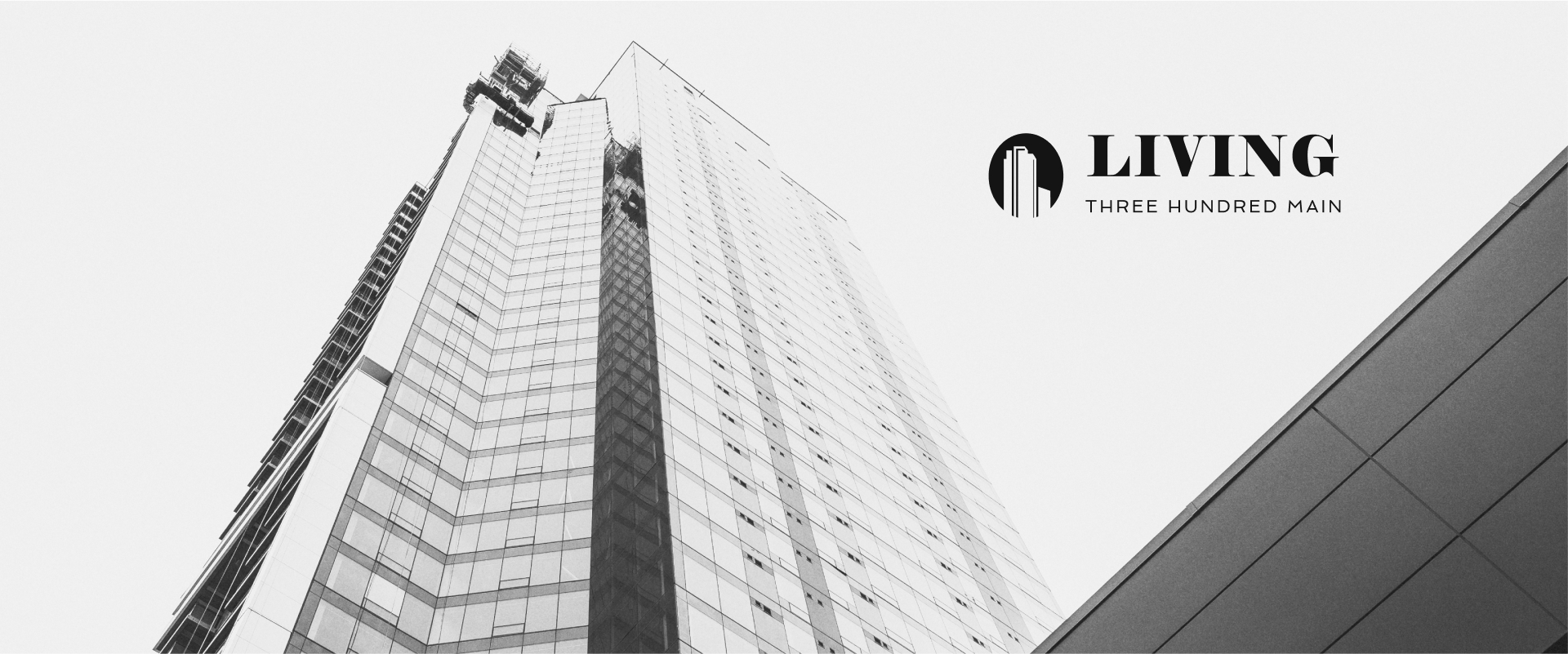
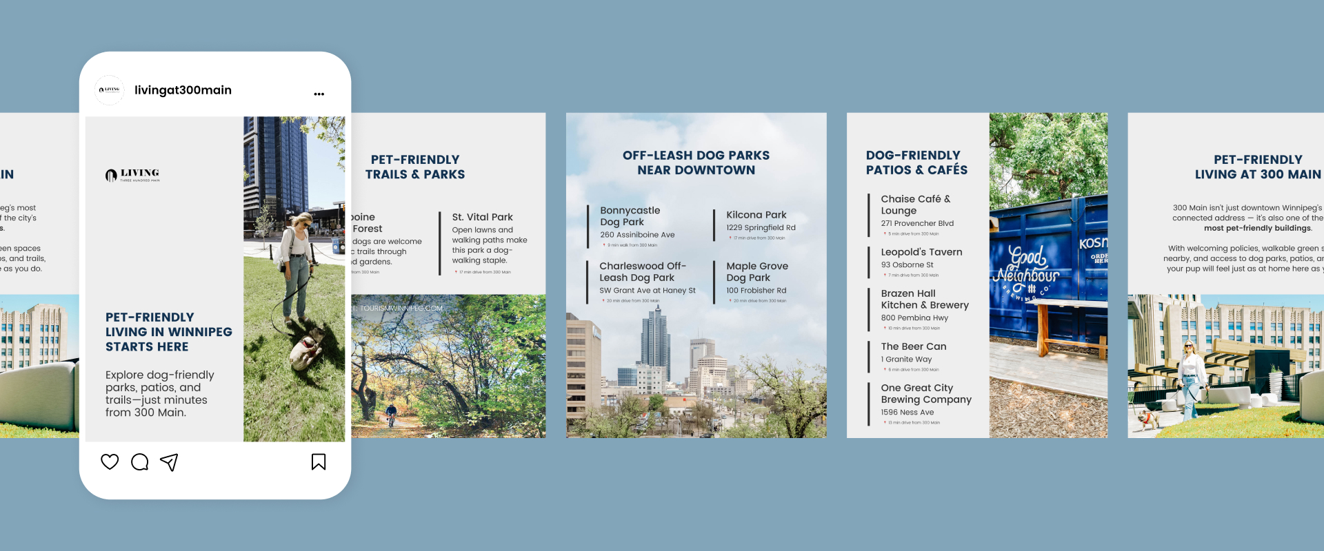
We were selected as the marketing partner to introduce this exciting project to the public. Our marketing efforts started with branding, creating the visual identity for this iconic edifice.
At the time we started our collaboration, 300 Main did not have a full brand identity except for the main logo, our journey started with crafting the branding elements and all collateral materials. The process started with a deep dive into 300 Main’s mission and core values, to communicate the brand’s essence, premium, unique, and trendy urban lifestyle. The colour palette and the imagery, inspired by the majestic skyline views, mirrored the building’s premium image and distinctive identity – the tallest residential building in Manitoba. The pattern was created to mimic the curvature of the numbers in the logo, and then repeated. .